
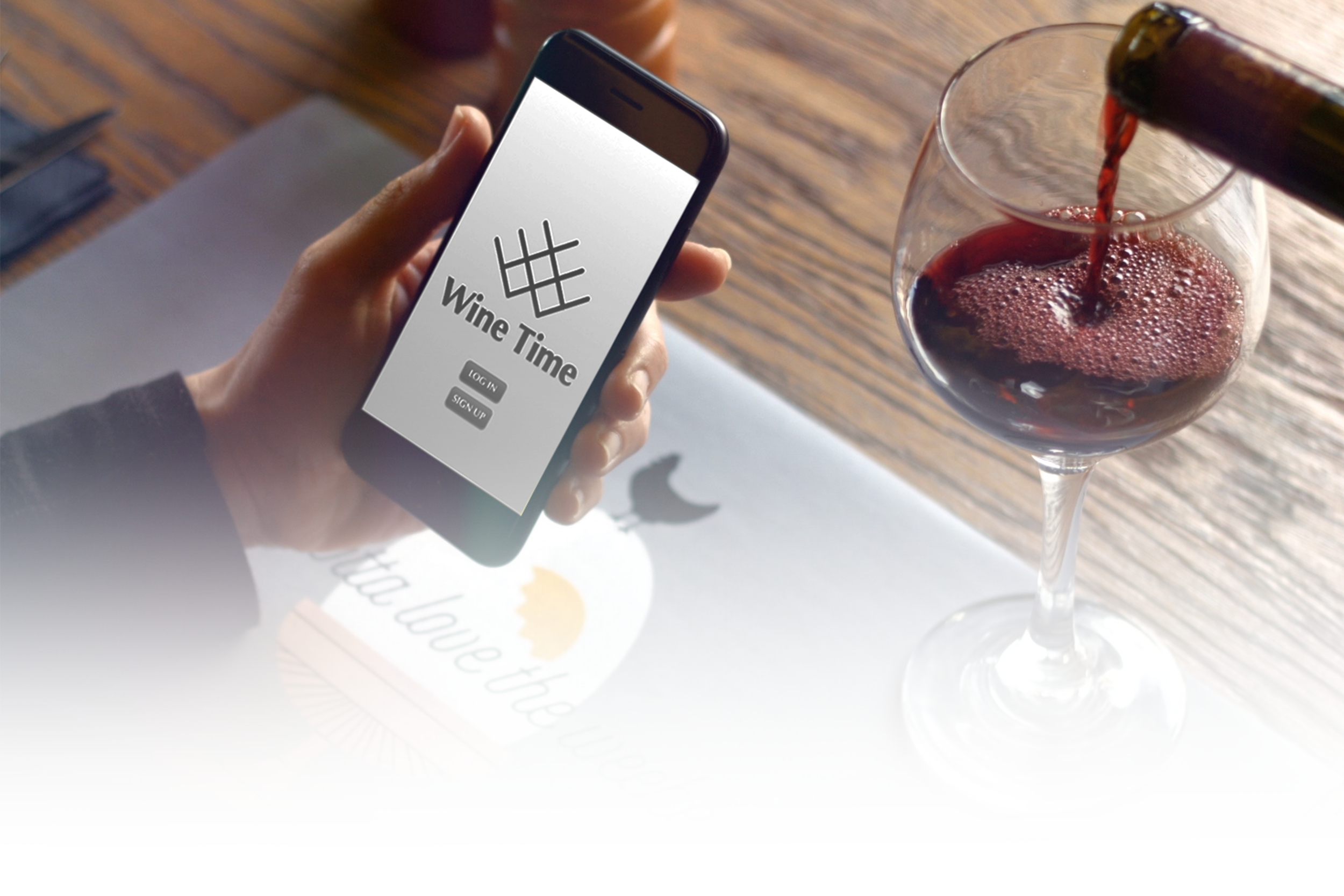
WINE TIME MOBILE APP DESIGN
Brand:
Wine Time
Overview:
A two-week design sprint to create a fictional mobile application that streamlines organization and searching for items in your wine collection; wether you’ve got a small collection or if you’re keeping track of multiple cellars.
Role:
UX Researcher & Designer
Responsibilities:
User interviews, affinity mapping, competitive research, journey mapping, research synthesis, wire framing and UI visual design & prototyping
Problem
Having an extensive wine collection is no fun if you can’t find the wine you want to drink when you want. Wine needs to be stored in racks that hide the label from view, making it difficult to quickly find a specific wine without pulling out each individual bottle.
This mobile app allows the user to quickly find what they’re looking for by displaying a digital wine rack that shows the labels in their collection, giving them the ability to quickly find what they’re looking by searching the cellar with customer filters.
Research Methods
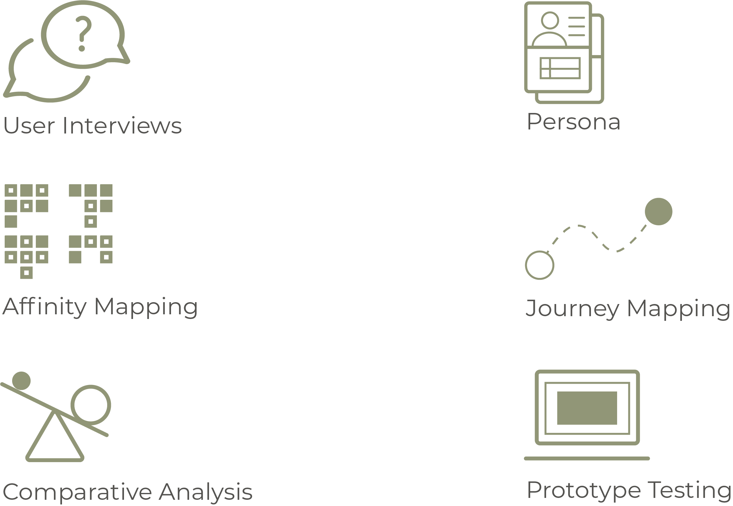
After familiarizing myself with popular wine apps like Vivino and Cellar Tracker and interviewing wine consumers, I found that the main points of frustration were:
Users were frustrated with the time it took to find a a specific bottle in their collection once it grew to a large size
Users wanted to customize the attribute information that they saw when looking at a wine’s profile, they didn’t care for extraneous information
Users want to learn more about wine from experts and get friends recommendations
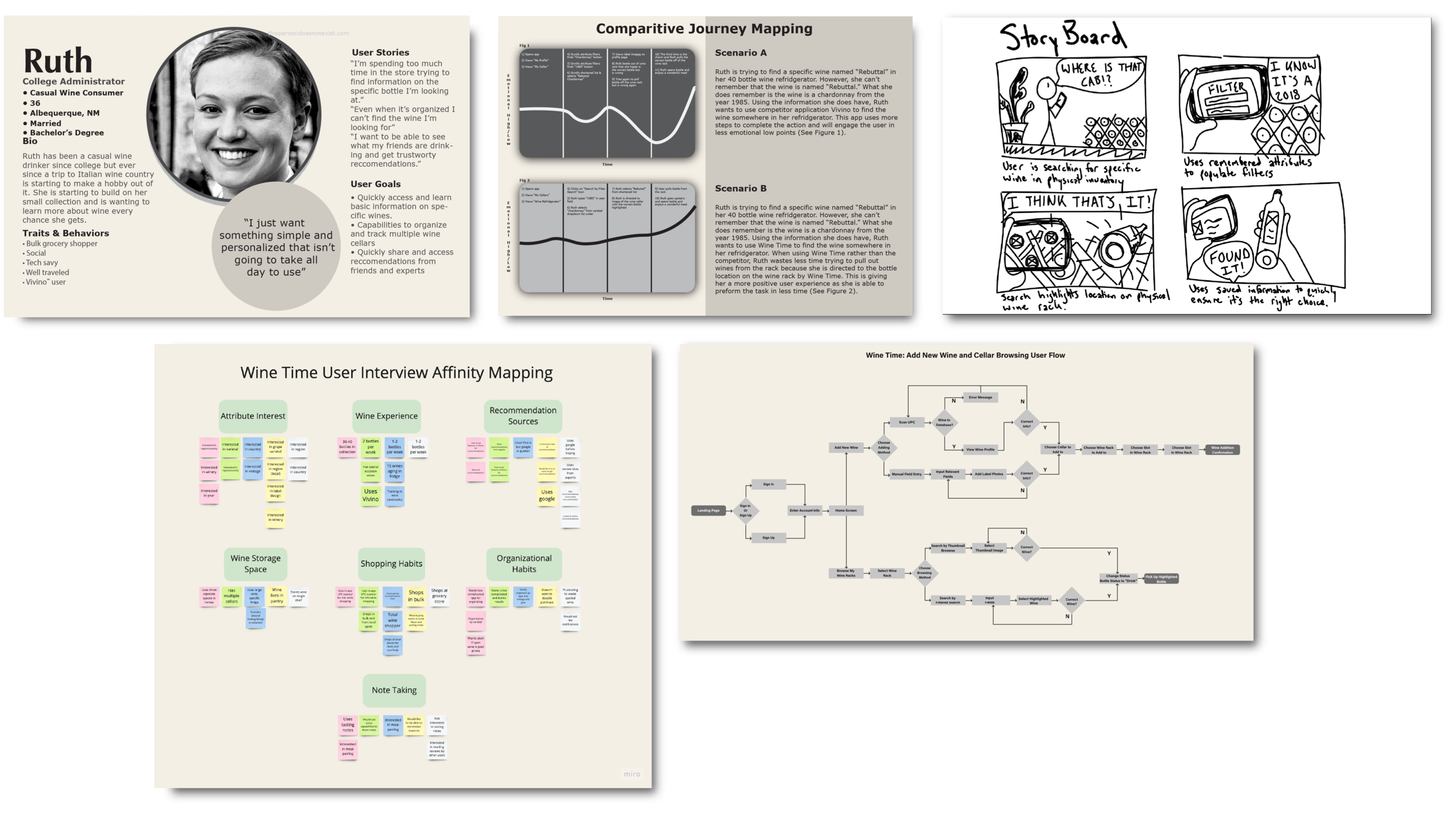
After interviewing users, I synthesized the research and created a competitive journey map, user flow and persona to develop and ideas around the features that I wanted to build.
For the purposes of the design sprint I focused on the cellar feature that would allow users to browse and search for wine in their personal cellar.
Prototyping and Testing
Cellar Space Customization
User can add up to 10 different unique cellars to the app and customize the size to reflect the actual storage space in front of them.
Find What You’re Looking for in a Flash
When viewing their inventory users are able to see a thumbnail of the labels on the racks. When showing results of a filtered search, the wines that fit the search are highlighted in on the rack to show where it’s location is.
Filtered Search
Users can use the filtered search to see the wine’s categorized on their shelf. Users can fill out as many fields as the need, whether they want to see where all their Zinfandels are or where a specific bottle is.
Easy Information Access
Users are able to see the tasting notes and reviews on each wine’s information card. When they wish to remove it from the shelf and drink it, they can do so with the “drink” button.
Challenges
Problem Statement Problems
I stuggled early on defining the problem which would lead me to the features I wanted to develop. I was focusing on pain points that users were having with the competitor’s app however the issue mainly lies within the inherent way that wine is stored. Stating what I needed to felt like I would be taking a step back in the process.
Affinity Mapping
The subjects that I interviewed fell into two categories of experience with wine very quickly. I initially didn’t want to include those who wouldn’t fit into my original ideas for the problem and the application itself. After further inspection I found some points that I could include in my research but it was a much longer process than I anticipated.
Lessons
You Have to Start Somewhere
This was my first ever project following a UX process and I was very satisfied with how it turned out. Having a background in graphic and web design I was itching to bring this to a higher fidelity on the first try, and not restraining myself from the get go led to some lost time. However, this taught me the lesson of the value of low-fidelity prototypes and I was able to get a lot of valuable time with research tools and design programs.